Here's a strange dynamic that few seem to be talking about: Our main tools for digital social interaction are shifting their focus from genuine social connection to passive media consumption. Just this year, Meta admitted that only 7 % of the posts an Instagram user sees come from friends.
In the meantime, social connection is increasingly recognized as key to our longevity.
Motivated by this, I spent my Bachelor’s thesis exploring the ways digital social design could better nurture its user’s social well-being, resulting in a calendar-based social platform for social planning. As the sole UX researcher and designer, I led the project from concept to validated prototype.


Once centered around connecting with friends and family, the biggest social media platforms have evolved to be optimized for user retention. This shift has primarily been driven by short to mid-form video and personalized feeds. As Meta stated in 2025, only 7% of the content users see on Instagram comes from their friends.
“At this point, you’re just watching TV with a chat function.”
— Eugene Healey
Research suggests that the social media experiences most conducive to well-being are driven by intentional interactions, not by filling idle moments with passive entertainment.
With this background, I spent my Bachelor’s thesis in Design exploring the ways social media design could better nurture its user’s social well-being, resulting in a calendar-based social platform for social planning. Since its completion, other social planning apps (Apple Invites and Partiful) have garnered widespread attention, validating the insights and the resulting concept.

As the sole researcher and designer, I drove the project from concept to validated prototype.
Due to the lack of a team, this also limits the cross-functional input and perspectives that we as designers typically benefit from. It also limited the scope of the project to design principles and prototypes.
Desk research
I read about digital social interaction and its potential to contribute to social well-being. This made me focus on social media and social planning.
Interviews
Six semi-structured interviews with the target group (more on them later), provided qualitative insights, which directly informed the initial focus on social planning, the creation of two personas, the user journey and their jobs to be done.
I involved this group continuously. This helped me uncover the problem initially, and validate and iterate on the concept later.
Surveys
I conducted surveys (n=25) asking people to rank social media features based on their perceived contribution to their social lives.
Personas
I synthesized my user understanding into personas, which informed the guiding principles for the design.
User journey and task flows: As-is and to-be
Based on the experiences gathered so far, I outlined the as-is journey to get clarity on where along the journey pain points actually occurred. I used this to ideate on solutions, validating concepts with users along the way.
Benchmarking
With a solid user foundation, I audited existing tools to identify essential features beyond the feed. I mapped core user flows, focusing on tasks like creating a plan and confirming a date, ensuring each task could be completed with minimal steps.
Iteration
I quickly moved into wireframing to test structural choices, iterating through rapid usability sessions to ensure the design remained aligned with user needs. After confirming the flows I refined the prototype into mid- and high-fidelity versions, continuing usability testing to keep the solution true to user intent.
Brand identity
For the final presentation of the project, I undertook a brand process as well. Muted colors, whitespace, soft motion, and humanitst typography with moderate x-height make Days feel instantly different from competitors, reinforcing the product’s promise.
Talking with users, narrowing the focus on social planning
Despite the inherent benefits of social networks, which often keep users from seeking out alternatives, a growing segment of users has begun migrating to platforms like Mastodon, Telegram, and Bluesky. Alongside this, there has been a rise in 'digital detox' products—apps, extensions, and even a return to analog alternatives like dumb phones—aimed at reinstating user agency in a world where design has reduced our attention spans to an all-time low.
To better understand the needs of users dissatisfied with mainstream social media platforms, I interviewed 6 individuals and designed a survey to explore their challenges and desires.
Several key themes emerged.
- Users experience compulsive behavior, which they attribute to their feed and notifications
- These users value chatting and other direct digital interactions
- Social planning in particular stood out as an essential use case that remains poorly served. Many of these users expressed frustration with how fragmented and chaotic current tools for organizing social events and activities are, especially how many rely on Facebook’s Events—which one user described as a "necessary evil" simply because all their friends have accounts there
Survey results further supported these insights: 68% of respondents ranked chatting and social planning as the most valuable social features, while 72% identified algorithmic feeds as the least useful.
Personas
From the interviews and surveys, two key personas emerged, each representing different facets of the tech-averse user segment.

Herman, 32
Digitally curious but cautious about the attention technology demands. A power user, overwhelmed by constant engagement and distraction.
"I’m curious about technology, but I’m also aware of how it eats up my time. I need tools that help me focus and give me control, not just another distraction."
Herman’s Needs
Solutions that offer real value without adding to his mental clutter
A platform that helps him engage intentionally
Flexibility to control his experience while also allowing for meaningful connections
Design Implication
Focus on purposeful interaction through social planning tools
Allow users to engage at their own pace
Make it clear that the design enhances their experience rather than overwhelms it

Lidia, 25
Digitally hesitant, avoids social media due to discomfort and distrust.
"Even though it makes a lot of things more frustrating, it's gotten to a point where I leave my phone at home."
Lidia’s Needs
An experience that feels simple, transparent, and trustworthy, allowing her to engage meaningfully without being bombarded
Tools that are easy to navigate and help her take control over her digital experience
Design implication
Design for App Fatigue. Lidia's threshold for downloading new apps is high. She’s hesitant to engage unless the value is immediately clear. This means the platforms Time-to-value (TTV) should be as short as possible without requiring extensive login or long commitments upfront
Talking with users also let me map out their journey (using a cabin trip as an example), clearly revealing where particular pain points occur, and users face when planning social events on existing platforms. This helped me break down the process of organizing social activities and identify where users encounter friction—whether they are using Facebook Events, WhatsApp, or a mix of multiple methods (which was usually the case).

Given these findings, it’s seems that social planning is an important yet underserviced element of social networks. While not the only positively regarded use case, it’s one that both incumbent platforms and new challengers are failing to prioritize, even though users are actively looking for it. These users want a more cohesive, intuitive way to organize and plan social activities—one that’s free from the distractions of algorithm-driven content.
Based on these insights, I identified some strategic moves to address the problem:
The blockers of social planning are about more than just logistics. It's also about momentum, clarity, and collective commitment. People want it to happen, but the process itself becomes the blocker. Centralizing the scattered process and reducing the logistical steps will help with this. The solution needs to be a central place to gather interest, confirm availability, and track decisions
Extract planning into its own space: Social planning must be liberated from the attention economy and given a dedicated, distraction-free space to focus
Try to keep chat as the primary canvas: Since users already engage in chat to coordinate plans, the conversation thread should serve as the central hub for organizing events. This mimics real-life interaction, where banter and pragmatism blend naturally. Plans should emerge from chats—but persist as structured, visible commitments.
Let plans emerge organically: Plans should be intuitive, evolving naturally from ongoing conversations
Low-friction, account-free invites for people on the fringe of the group. A system that respects the fluidity of planning while reducing the burden on the organizers
Scoping and Architecting
From insights to design
Once I knew what qualities to look for in planning features, I began benchmarking direct competitors (social planning apps and reviewed state-of-the-art social media designs. This allowed me to evaluate how well these platforms supported social planning and where they fell short.


With a clear user lens and an understanding of common social planning flows, I audited the content in the benchmarks, listing every screen element and function to understand what actually matters once the feed is gone. I then mapped end‑to‑end user flows for core tasks like “create a plan” and “confirm a date,” making sure each pathway could be completed with as few taps as possible.

Solution
Where I got and how I got there


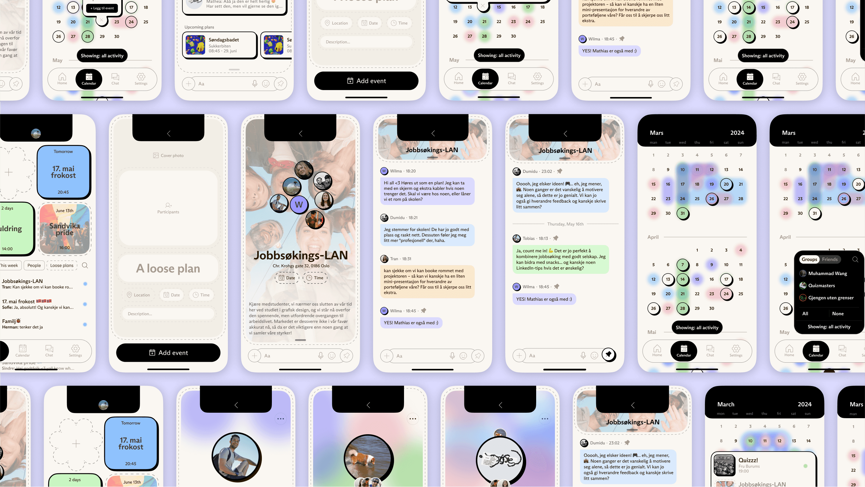
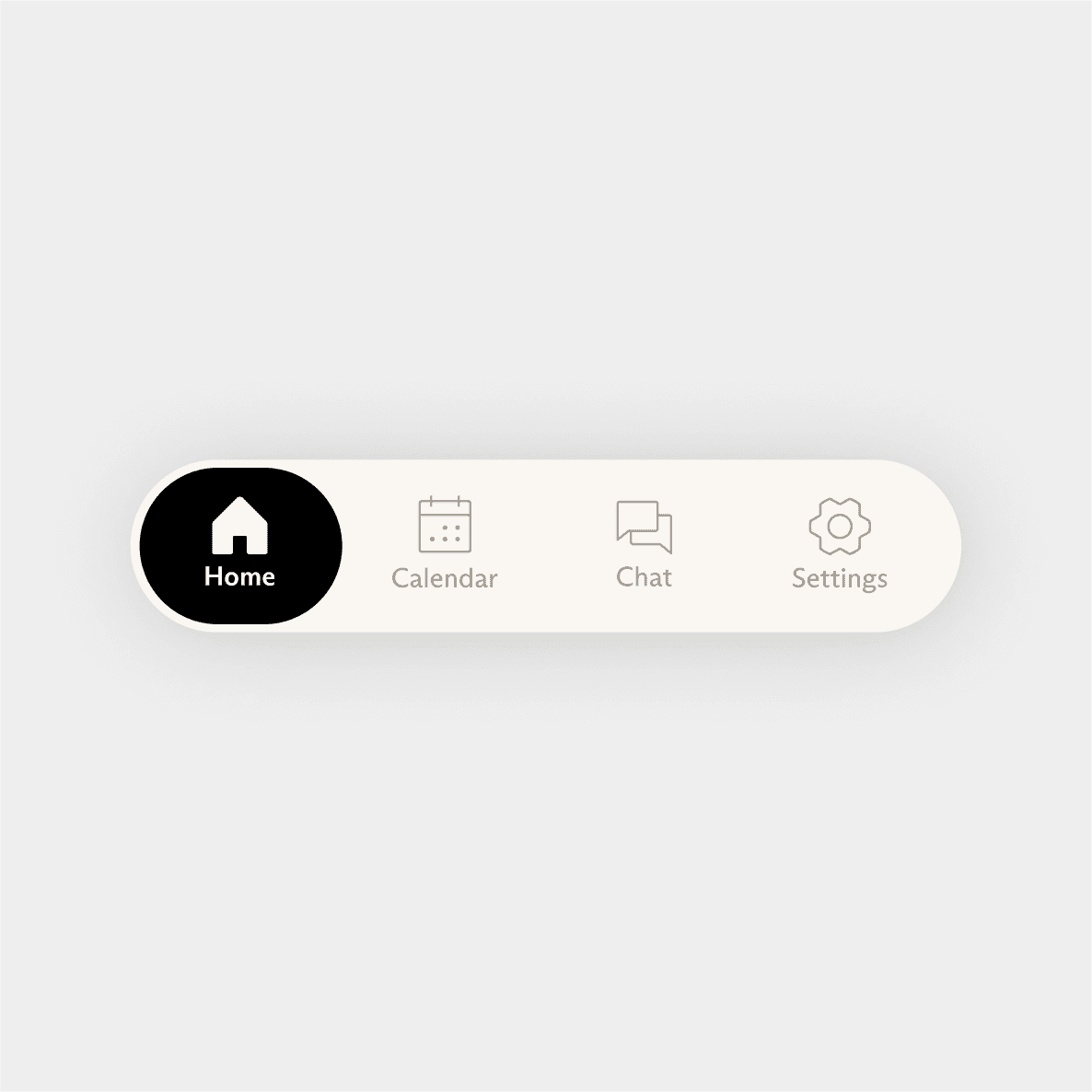
Dashboard
The dashboard centers social planning completely, resulting in a lightweight app that promotes physical interaction by making social planning easier.
Plans
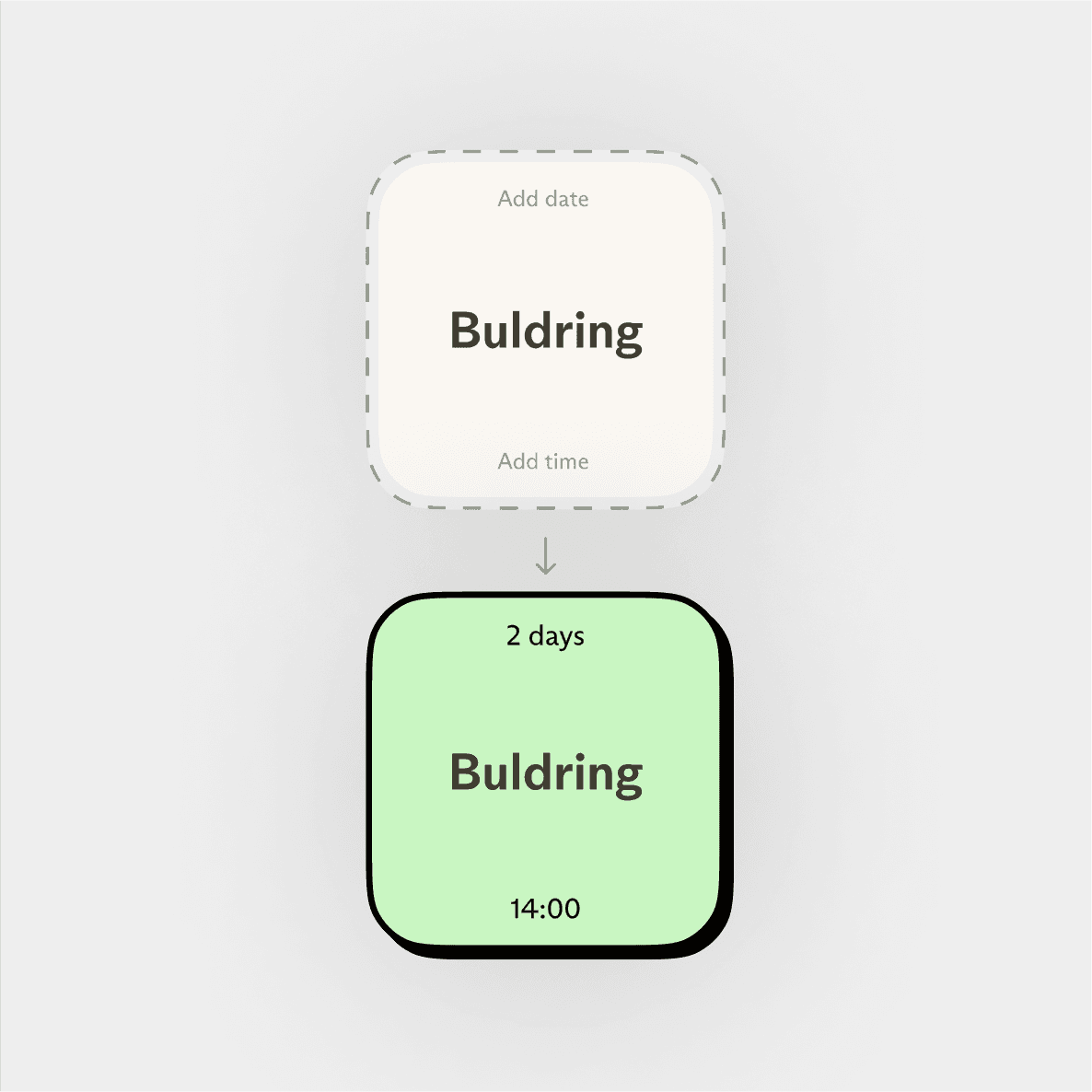
The top half of the dashboard focuses on immediately upcoming plans, with one prominent button allowing you to quickly add new plans.
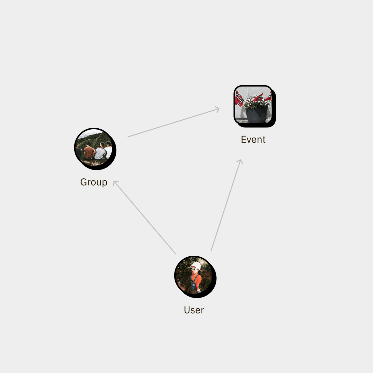
Plans are separated into two broad categories. Loose Plans are indicated by dashed lines, and become Plans once a date and time is set, and people are invited.


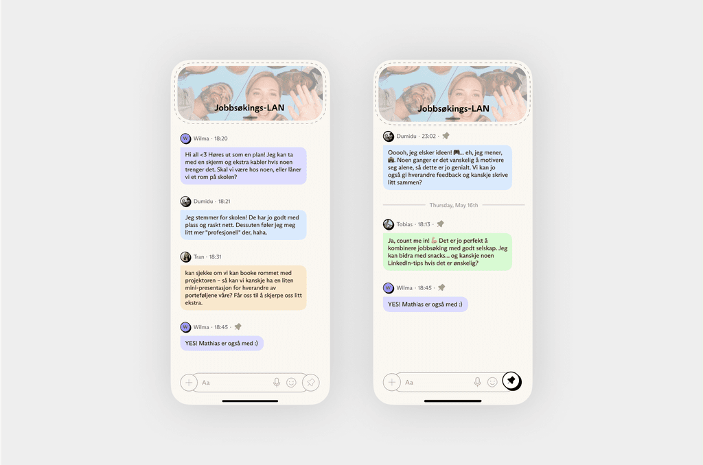
Every event gets a chat
The profile lives inside the extended notch. Including only name and image, it is only enough information to be useful identifier. Purposefully lightweight to avoid social comparison and profile fixation, some of the main aspects of social media associated with negative mental health outcomes.


Pinned messages
A problem with social planning is that it needs to be both casual and conscientious. It needs to strike the balance between the organic flow of conversation, and the systematic work that is organizing. The Pin Board is promoted heavily, being readily available in the bottom right of the chat bar.
Early prototypes relied on AI by having generated summaries of plan-relevant conversations readily available. But this came at the expense of user agency, something the target group valued.
A note on this feature: There is definitely space to explore this balance further. See for example Slack’s threaded conversations, or Apple Mail’s use of AI to summarize e-mail contents.
Other highlights

Barebones profile section, compatible across notch types
The profile lives inside the extended notch. Including only name and image, it is only enough information to be useful identifier. Purposefully lightweight to avoid social comparison and profile fixation, some of the main aspects of social media associated with negative mental health outcomes.

Heatmap calendar
The heatmap calendar allows users to share availability subtly without sharing every detail of their schedule, and without the need for attention-grabbing design. Inspired by research concluding that even low-bandwidth, ambiguous design interventions are sufficient to effectively induce an immediate sense of social connectedness.
Learnings and acknowledgements
Learnings and acknowledgements
Challenging mental models
One of the biggest learnings was the success of interlocking events and chats. Initially, this decision seemed risky due to its novelty, but after testing, users had an “aha moment” that made the experience intuitive and engaging. This was a reminder that innovative design often requires cognitive effort, but if it’s learnable, it can create impactful moments.
Designing with Empathy
This project reinforced the importance of designing for real user needs, especially those who are weary of social media. The emphasis on clarity and user control was key to alleviating frustration. A user-first mindset is paramount to creating solutions that feel both fresh and familiar.
Thank you to Trond Klevgaard for guidance, and of course a special thanks to the participants who provided candid, thoughtful feedback. Your input was crucial to the success of this project.
Related projects